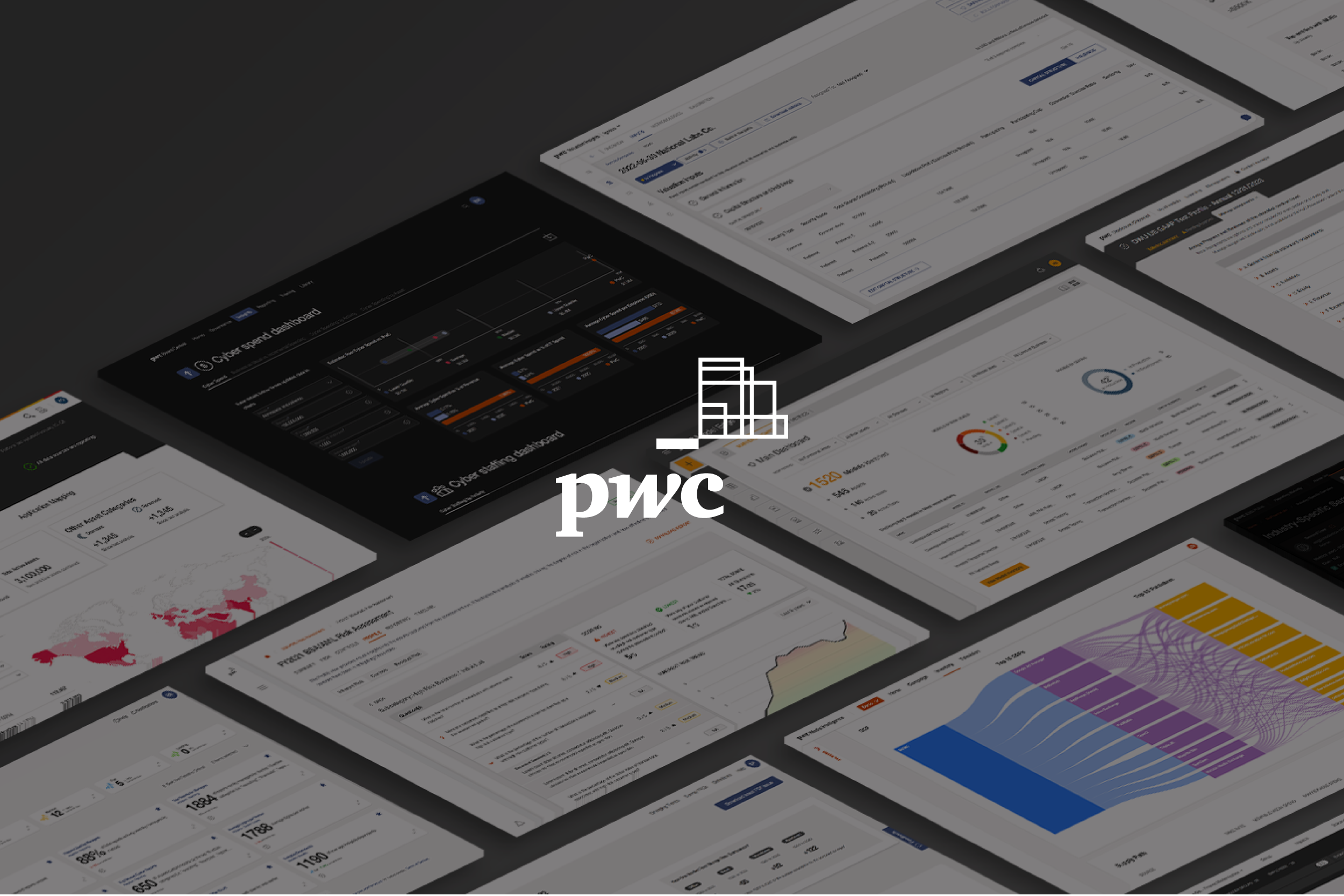
In 2017, I led the end-to-end creative development and execution of PwC’s Products & Technology brand — shaping its visual identity, UI/UX standards, and full marketing ecosystem. I directed a large multidisciplinary design team to build cohesive experiences across PwC’s suite of SaaS solutions, from platform interfaces and design systems to product narratives, launch campaigns, and sales enablement. By unifying strategy, design, and storytelling, I helped translate complex technology into a clear, trusted, and human-centered brand presence that accelerated adoption and differentiation in the market.
• 150+ touchpoints and templates created
• 500+ applied assets
• Drove $2.5 million in annual savings YOY through the optimization of creative operations, process evolution and AI integration
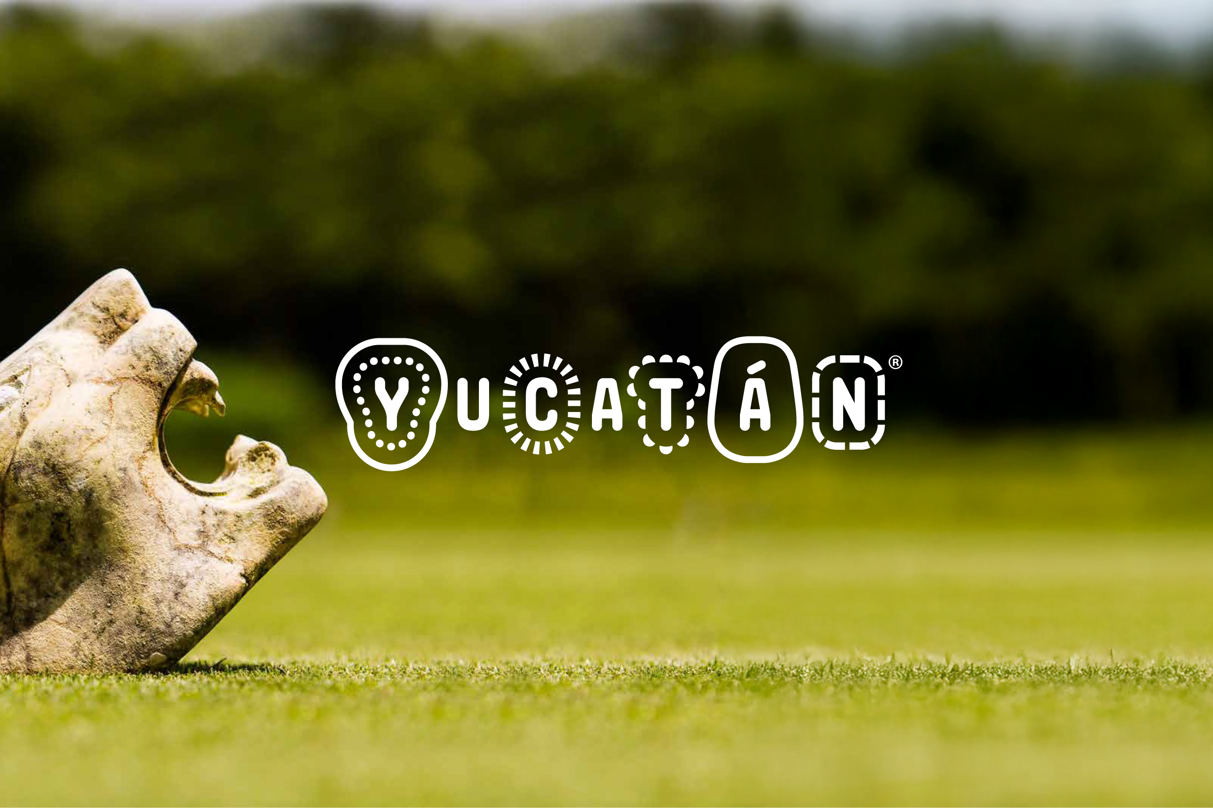
Entering the competitive world of global tourism, Yucatán sought a brand that could capture its rich culture, natural beauty, and unique experiences while standing out on the world stage. My team was tasked with creating a visual identity and digital presence that could tell that story at every touchpoint.
I guided a large multidisciplinary design team to define Yucatán’s visual identity, narrative foundation, and immersive digital experience. We developed a comprehensive brand system that translated seamlessly across web, mobile, and interactive platforms. At the same time, I oversaw all marketing campaigns and launch materials, delivering high-impact visuals and storytelling that elevated Yucatán’s global profile.
• 75+ touchpoints and templates created
• 150+ applied assets
• 37% increase in customer engagement in the first 90 days of the brand refresh
In 2025, I helped roll out the firms new brand identity and part of the launch was the release of PwC’s Global Annual Review campaign as a cornerstone of PwC’s newly refreshed global brand. The campaign served as one of the first large-scale expressions of the refreshed brand system, bringing the new identity, voice, and design principles to life across a high-visibility, global platform. We delivered a cohesive, premium experience spanning both digital and physical touchpoints. Deliverables included a custom-built web experience, a global photoshoot, a social-first and paid campaign, motion assets, and a high-end printed report. By translating complex performance data and strategic insights into a clear, human-centered narrative, the campaign reinforced PwC’s credibility, transparency, and leadership while setting the creative standard for the brand moving forward.
In a world of traditional energy solutions, Nustreem was entering the market with a bold promise: compact, modular hydropower that could deliver reliable electricity to irrigation districts, mining operations, and remote communities. But as a newcomer, they needed more than innovative technology—they needed a brand that signaled leadership, reliability, and mission-driven impact.
Nustreem engaged my team and I to craft a visual identity and product branding that could carry their story across web, interfaces, and marketing channels. Under my leadership, we developed a comprehensive brand system—color, typography, iconography, motion, photography and more—that ensured consistency and clarity at every touchpoint. We also managed marketing campaigns and launch materials that positioned Nustreem’s solutions as modern, efficient, and transformative.
The result was a cohesive brand presence that made Nustreem instantly recognizable as an innovative leader in modular hydropower, communicating reliability, purpose, and forward-thinking technology to every audience.
In a crowded hospitality market, Hilton Sandestin Beach Golf Resort and Spa needed more than just luxury accommodations to stand out. With travelers evaluating a wide range of options online, the existing website and booking experience were no longer enough to capture attention or drive conversions. The resort challenged itself to elevate its digital presence and marketing, and our team was tasked with bringing that vision to life.
We redesigned Hilton Sandestin Beach’s website, booking engine, and marketing campaigns, creating a modern, intuitive digital experience that reflected the resort’s premium brand. By reimagining the user journey, updating visuals, and aligning messaging across every touchpoint, we helped ensure that every interaction communicated the resort’s elegance, warmth, and distinct personality. The result was a cohesive digital presence that not only engaged visitors but also drove measurable increases in bookings and brand affinity.
Sparks Belting had built a strong reputation in industrial solutions, but their visual identity and brand experience no longer reflected their expertise or growth ambitions. The company challenged itself to modernize and unify its presence, and our team was brought in to lead the transformation.
We rebuilt Sparks Belting’s entire brand from the ground up, creating a cohesive visual identity, messaging framework, and brand system that could scale across all touchpoints. From logo and typography to color, iconography, marketing collateral, and digital presence, every element was carefully crafted to communicate reliability, innovation, and industry leadership. The result was a revitalized brand that strengthened market perception, aligned internal and external communications, and set Sparks Belting up for long-term growth.
When NASCAR and International Speedway Corporation came to us, they needed more than fresh graphics—they needed creative storytelling that matched the adrenaline, heritage, and high-stakes drama of major races like the Amp Energy 500. Over several years, I led a multidisciplinary team to rebrand and design for ISC’s many tracks and marquee events, ensuring each campaign felt authentic, energetic, and unmistakably part of the NASCAR legacy.
From concept to execution, we crafted a dynamic visual identity system—bold typography, high-contrast color palettes, motion-enhanced graphics, and immersive event assets—that brought the speed and spirit of racing into every touchpoint: TV, digital, print, OOH, and on-site signage. We also developed digital campaigns for ticketing, live event promotion, and social engagement, marrying design and strategy to drive attendance and deepen fan loyalty.
By aligning our creative work with ISC’s heritage and NASCAR’s modern momentum, we created campaigns that delivered both impact and cohesion—fueling excitement and reinforcing ISC’s position as a premier storyteller in motorsports.
In a crowded spirits market, Three Olives Vodka wanted a way to make their Marilyn Strawberry flavor truly stand out. They challenged my team and I to create a package and campaign that celebrated the iconography of Marilyn Monroe while maintaining the brand’s playful, modern personality.
We co-led the partnership with the Marilyn Monroe Foundation and developed a visual system that translated her iconic persona into bold, collectible packaging and launch materials. From the bottle design to campaign assets across digital, print, and social, we crafted a cohesive story that felt both aspirational and fun. Every element—from color and typography to photography and motion—was designed to engage fans, elevate the flavor’s presence on shelves, and create a campaign that felt instantly recognizable and culturally relevant.
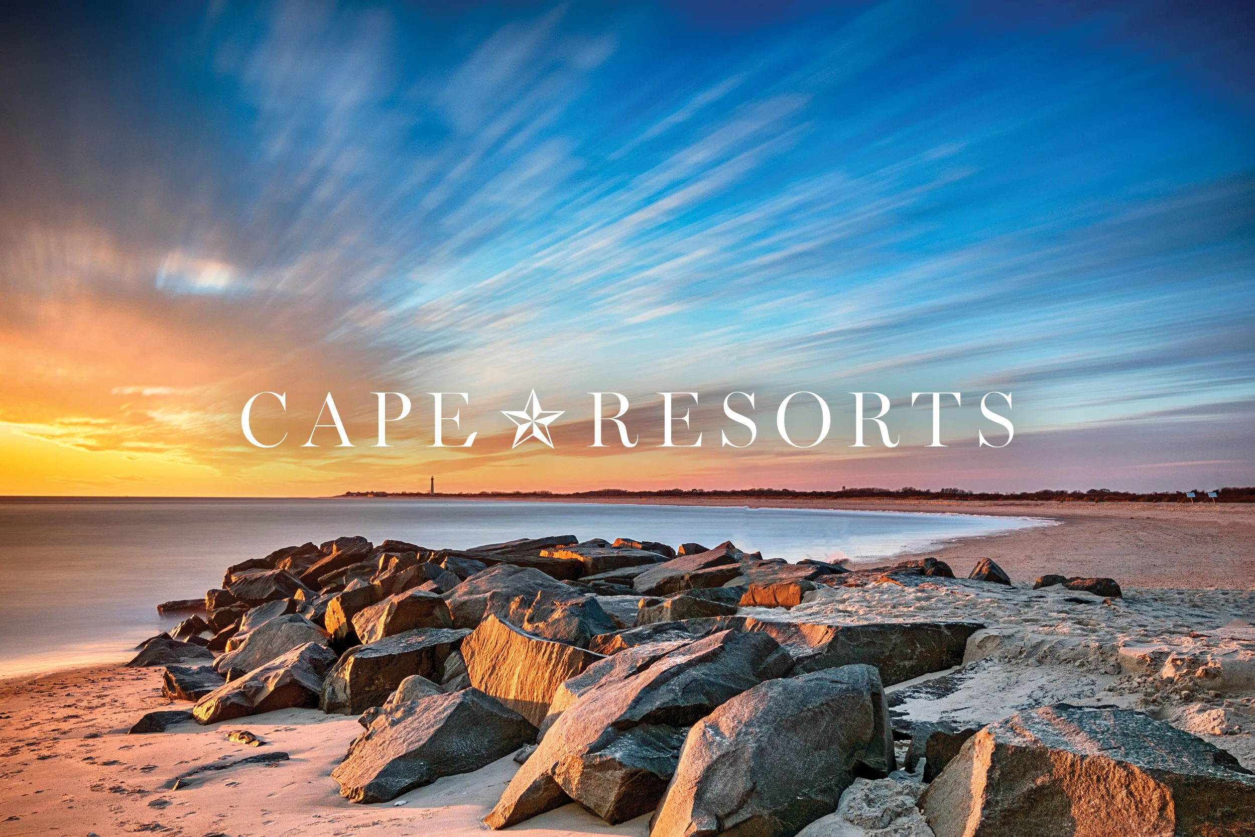
Cape Resorts wanted their online presence to match the elevated experiences and unique escapes their properties offer. They challenged us to reimagine the website as a digital reflection of their brand, making it both visually striking and effortless to navigate.
I led the redesign from strategy through execution, defining a refreshed visual identity, modern UI/UX, and responsive design for desktop and mobile. We integrated immersive photography, dynamic layouts, and clear pathways to booking, ensuring every visitor experienced the brand’s sophistication and ease. Across marketing touchpoints, campaigns, and digital touchpoints, the redesigned site reinforced Cape Resorts’ premium positioning and helped drive engagement and reservations.
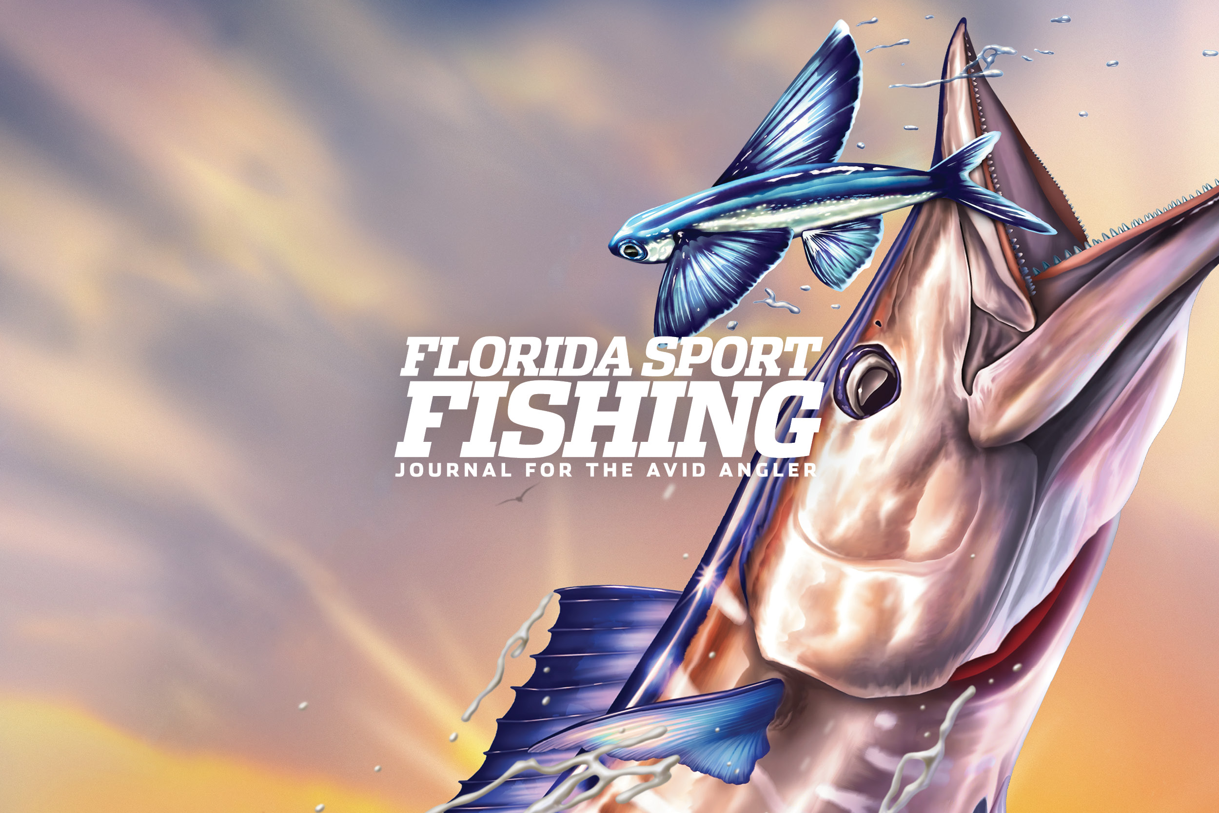
In a crowded magazine market, Florida Sport Fishing Magazine had built a loyal following, but the visual identity and reader experience no longer reflected the excitement and expertise of the brand. They needed a rebrand that would modernize their look while honoring their heritage.
I redesigned the publication, creating a bold and dynamic new visual identity. The refreshed logo retained elements of the magazine’s legacy while introducing a contemporary edge that could carry across print layouts, digital platforms, and social media. A revitalized color palette, typography system, and graphic treatments brought energy and clarity to every page. Across the magazine, website, and marketing materials, the reimagined Florida Sport Fishing Magazine brand communicates authority, adventure, and the thrill of the sport—capturing readers’ attention and elevating the brand in the competitive lifestyle category.
GE’s sealants were known for performance but lacked a distinctive visual presence on shelves. The category was evolving, and a strong, clear identity was needed to stand out and communicate value beyond technical specs.
I led the brand and packaging redesign, creating a cohesive visual system that brought clarity, consistency, and personality to the products. The refreshed packaging highlighted GE’s reliability while introducing bold typography, structured layouts, and a distinctive color palette that could anchor the brand across different sealant lines. Every element—from graphics to messaging—was designed to communicate trust, innovation, and ease of use. The reimagined GE Construction Sealants brand now stands out on shelf, clearly signaling professional-grade quality and smart choice to customers.
Grand Junction needed a fresh identity that reflected its unique character and aspirations. The existing logo no longer captured the vibrancy and energy of the city, and it was time for a visual signal that could unify its presence across communities, signage, and digital platforms.
I led the logo redesign, creating a mark that balanced modernity with approachability. The new design emphasized Grand Junction’s spirit and location, introducing dynamic forms and a color palette that could flex across collateral, wayfinding, and communications. Every element was crafted to feel welcoming, memorable, and instantly recognizable. The reimagined Grand Junction logo now communicates the city’s vitality and pride, giving residents and visitors a visual identity that resonates at every touchpoint.
Naples Grand Beach Resort needed a digital presence that matched the elegance and experience of its beachfront property. The existing website and booking engine were functional but failed to capture the resort’s luxury, personality, and ease of use.
So we rebuilt it all, creating a streamlined, visually engaging website and intuitive booking experience. We introduced a clean, modern interface, flexible layouts, and immersive imagery that conveyed the resort’s atmosphere. Enhanced navigation and seamless booking functionality made planning a stay effortless, while the design system ensured consistency across marketing campaigns and digital touchpoints. The reimagined website and booking engine now communicate luxury, convenience, and hospitality, inviting guests to experience Naples Grand Beach from the first click.
Healthbridge needed to stand out in a crowded healthcare technology landscape. Their existing identity communicated capability but lacked warmth and clarity, making it hard to connect with both providers and patients.
So we dove in and created a cohesive, modern visual identity that communicates trust, expertise, and accessibility. The redesigned logo emphasized connectivity and flow, anchored by a fresh color palette and typography system that carries across digital, print, and marketing touchpoints. Thoughtful iconography, motion, and imagery help simplify complex healthcare concepts, while campaign and web assets ensure a consistent, approachable presence. The reimagined Healthbridge now clearly communicates innovation, reliability, and human-centered healthcare.
Every two years, the Daytona Beach International Festival comes to life—but the 2007 campaign was particularly momentous: it would be the last time the city hosted the London Symphony Orchestra. With just four months to execute, our team was tasked with creating a full suite of assets that captured the event’s prestige and energy.
I led the creative, guiding a multidisciplinary team through branding, experiential design, and a national ad campaign. This included a high-end photoshoot (with a National Geographic photographer I brought on board), large-scale collateral, local OOH billboards, and immersive event environments. In parallel, I forged a strategic partnership between the Festival and the Daytona Beach CVB, ensuring the campaign elevated both the festival and the city’s profile. The resulting campaign combined sophistication, excitement, and local pride—turning a fleeting moment into a memorable, citywide celebration.
Tradewinds Island Resorts and the Guy Harvey Outpost in St. Pete Beach faced a pivotal moment: they needed a full-scale rebrand that would modernize their presence and capture the essence of the destination. I led the creative, guiding a multidisciplinary team through every touchpoint—from rebuilding their website and booking engine to redesigning the hotel’s tradedress and visual identity.
We recreated the national ad campaign, OOH, experiential and tradeshow designs, online advertising, and a photoshoot to capture the new messaging and elevated experience. The campaign unified the brand across digital, print, and physical environments, transforming how guests perceive and engage with the resorts. By leading strategy, execution, and cross-functional collaboration, the team delivered a cohesive, high-impact rebrand that positioned Tradewinds as a premier destination in St. Pete Beach.
PGA National wanted to elevate its digital presence and make booking seamless for members and guests. I led the creative, guiding a multidisciplinary team to rebuild the website and booking engine from the ground up.
We reimagined the user experience, updated the interface design, and aligned the site with PGA National’s brand identity, ensuring a cohesive, modern look across every digital touchpoint. By overseeing strategy, design, and execution, the team delivered a streamlined, high-impact platform that improved usability, reinforced the brand, and enhanced the overall guest experience.
Florida Hospital wanted to showcase its network of healthcare partners while giving each physician a distinct yet cohesive presence. I led the creative, guiding a team to develop a sub-brand and regional campaign that highlighted 150 physicians.
We created a scalable collateral design system, ensuring each physician’s materials felt personalized but consistent with the overarching brand. A high-end photoshoot captured the physicians in their environments, providing authentic imagery to bring the campaign to life. By directing strategy, design, and production, the team delivered a polished, high-impact program that elevated the visibility of Florida Hospital’s healthcare partners and reinforced trust and credibility across the region.
Florida Greenscapes wanted to elevate their presence in the luxury landscape design market. I led the creative, directing a team to develop a refreshed brand identity that conveyed elegance, expertise, and a connection to nature.
We reimagined the visual system—refining the logo, color palette, typography, iconography, and photography style—to reflect the company’s high-end positioning. The team applied the new identity across digital platforms, marketing collateral, and client presentations, ensuring consistency and sophistication at every touchpoint. By guiding strategy, design, and execution, we created a brand that clearly communicates Florida Greenscapes’ premium craftsmanship and attention to detail, positioning them as a leader in the luxury landscape design space.
Adventist Health System wanted their 2009 annual report to feel as exceptional as the care they provide. I led the design in reimagining the report, designing every page to balance clarity, storytelling, and visual impact. I introduced high-end custom printing techniques—embossing, spot UV, and perfect binding—to elevate the tactile and visual experience.
The result was a polished, sophisticated annual report that set a new standard for the organization. Every spread reflected Adventist Health’s professionalism and attention to detail, making it their most visually striking report to date while reinforcing the brand’s commitment to excellence.
After a distinguished career as VP of Marketing at a well-known fortune 500 Company, a close friend wanted to create a personal identity that reflected their expertise, professionalism, and forward-looking vision in retirement. I led the development of a complete identity system, crafting a logo, color palette, typography, and visual elements that balanced authority with approachability.
The system extended across business cards, digital profiles, and personal collateral, providing a cohesive, polished presence. Every element was designed to communicate credibility, sophistication, and clarity—capturing a career of achievement while signaling a new chapter of purpose and impact.