
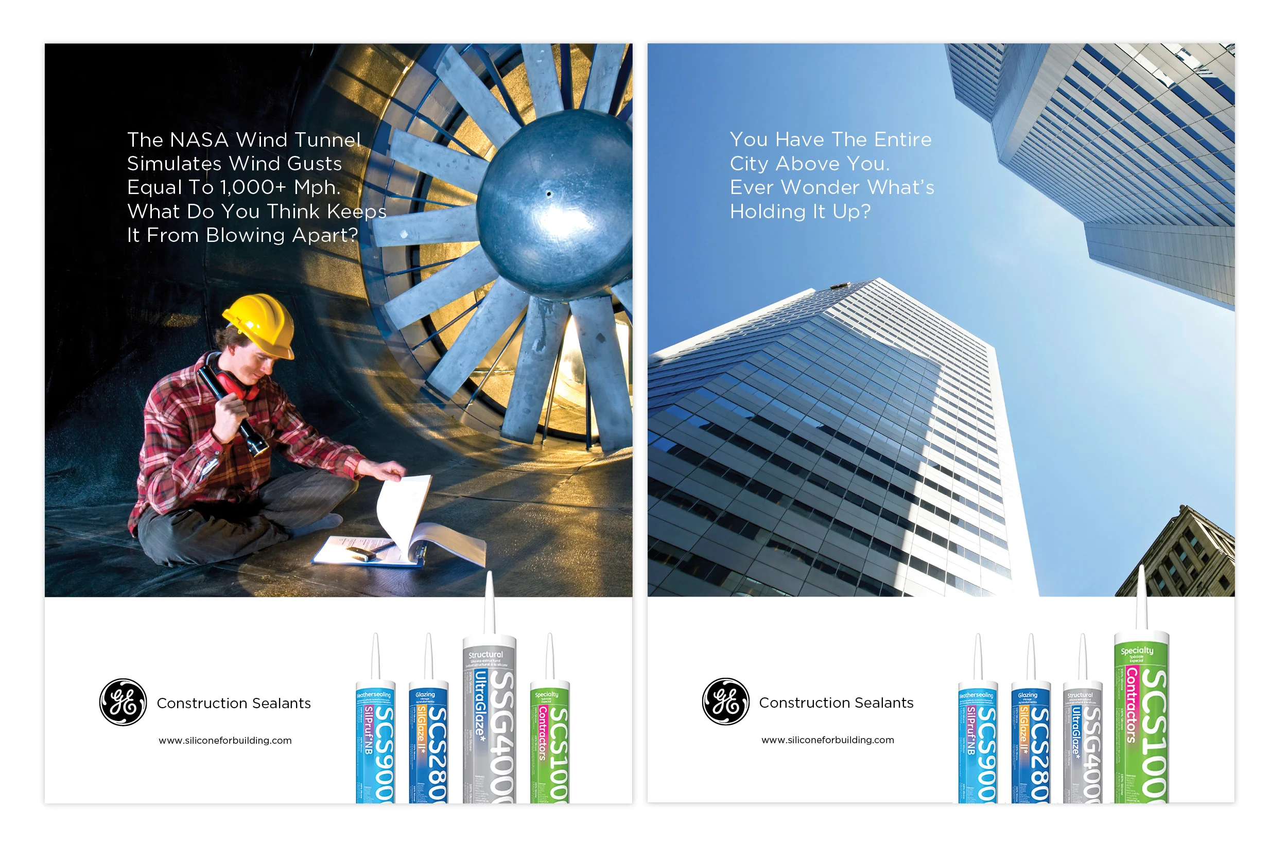

GE’s sealants were known for performance but lacked a distinctive visual presence on shelves. The category was evolving, and a strong, clear identity was needed to stand out and communicate value beyond technical specs.
I led the brand and packaging redesign, creating a cohesive visual system that brought clarity, consistency, and personality to the products. The refreshed packaging highlighted GE’s reliability while introducing bold typography, structured layouts, and a distinctive color palette that could anchor the brand across different sealant lines. Every element—from graphics to messaging—was designed to communicate trust, innovation, and ease of use. The reimagined GE Construction Sealants brand now stands out on shelf, clearly signaling professional-grade quality and smart choice to customers.